 These days when you’re looking to improve or overhaul your web design, factoring in how it will look to handheld device users may be a factor to consider.
Mobile devices include smart phones and all manner of tablets.
Mobile device usage on your website
According to w3 schools, mobile device usage still accounts for less than 2% of overall web traffic, however in North America and Web Savvy cities like Calgary, these numbers tend to be much higher.
Check out your Google analytics or web traffic statistics to determine what percentage of your audience is on a handheld device when they land on your site. More importantly though, how are they behaving once they get to your website? Do you have a high bounce rate from handheld device users? Are their page views dramatically less than those on laptop or desktop devices?
If your handheld device audience is clearly turned off by your existing website design, and they’re a large percentage of your website visitors, you may want to consider a mobile web design.
That being said, you have 3 different options, with three different prices to address the needs of mobile device users on your website.
Here are 3 different options of mobile web design:
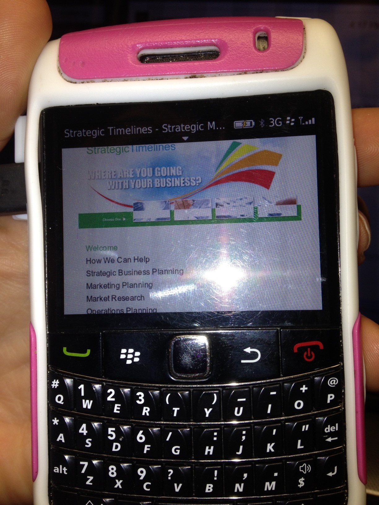
A mobile friendly website: This essentially means your website isn’t offensive or broken to the user. It ensuring your website is scalable and simply displays as a smaller version of itself on devices such as android, iphone, ipad etc.
Addition of a mobile plugin: A great and cost effective option for WordPress websites is a plugin that, when configured correctly, can display a mobile specific version of the website to your visitors. Essentially appearing as a large menu to start, this provides a quick an easy way for your visitors to get to where they want to go on your website. A mobile web design plugin can be installed in a medium sized WordPress website in roughly 10 hours. So, the cost will vary depending on your web designers rates.
Creation of a specifically mobile web design: For businesses with a large stake in the market of mobile users. An option where we create a whole new web design that is geared specifically to the needs of the user. All non-essential content and navigation is stripped down, providing only the required navigation and content that a user will need.
About as expensive as a standard web design, a specifically mobile web design takes into consideration the reduced screen size, and hurried nature of today’s users.
Often, screens will be basically empty except for a link to call, get directions with Google maps or place their order online/sign up.
The mobile web design user experience
Converting casual browsers to sales is typically easier for the retail business and handheld device user, as often the user is en route to purchase the product or service and needs simply to identify what location is the closest and most appropriate for fulfilling the user’s needs.
In this case, often all that is needed is a large phone number or map.
By considering the visitor usage, the 3 different options and the user experience, you can determine the best mobile web design solution for your unique business.
Learn more about web design services.
Your Turn!
I’d love to hear your questions or challenges – Tell me in the comments below.
And, if you enjoyed this post, please share it!
 Laurel Lindsay is a Calgary Internet Marking Consultant & President of The New Media Group Inc. She has over 8 years hands-on Internet Marketing experience.
Laurel is enthusiastic and passionate about helping people live better lives by leveraging the power of the internet.