if you haven’t been paying attention to how your customers and the general population is obsessed with their mobile devices, now is the time to start paying attention.
If you regularly review your website statistics using tools like Google Analytics, you will have noticed that the website traffic from mobile devices has been steadily increasing to almost half, if not the majority of your website visitors.
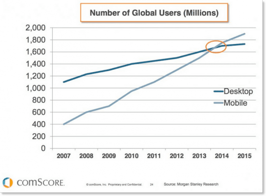
As of 2014, mobile web usage overtook desktop usage, and to accommodate the shift in consumer behaviour, Google is laying down the law for businesses that aren’t adapting.
As of April 21st, 2015, Google announced it will start penalizing websites it’s labelled as being non mobile friendly- source Search Engine Watch- full article here
That means if you’re concerned about where your business shows up on Google search results, you need a mobile website before April 21st.
What defines a mobile friendly website?
From Google Webmaster Tools- these are the 5 most desired elements of a mobile website:
- A defined viewing area (or viewport) that adjusts to the device’s screen size.
- Content that flows in the viewport, so that users don’t have to scroll horizontally or pinch the screen in order to see the entire page.
- Fonts that scale for easier reading on small screens.
- Easy-to-touch elements (e.g., buttons) that are well-spaced from other touch elements.
- Visual design and motion driven by mobile-friendly technology.
How do I decide if I need a mobile friendly website?
First, ask yourself if you’re concerned with displaying in google search results. If you’re not, then a mobile website likely wont be as high of a priority to companies that do have their google ranking as a priority.
Then, check your website statistics to see how many visitors are using your site on a mobile device. If the bounce rate and time spent on the website is virtually the same as desktop users, than your website is working for mobile users.
Most of the time, what we see though is a higher bounce rate and drop off than with desktop users. This is a not so subtle indicator that your website isn’t working for your mobile visitors.
What are my options for getting a mobile friendly website?
You have 2 options to choose from. The first is a mobile responsive website which essentially resizes and configures your regular website to fit the wide range of screen sized of tablets and phones.
This is more expensive to set up as it involves “chopping up” the elements of your existing website. However, it gives a uniform look across all devices and doesn’t require any additional hosting fees.
The second is a mobile website, which offers a mobile targeted experience to users. Completely different, your mobile website offers larger navigation and a simplified version of your existing site.
The mobile site offers a better experience for mobile users, with enlarged text and menu buttons, but does have the downside of additional hosting fees.
Both options can be created for you in about a week’s time by any web development company.
You may have also heard of branded apps for your business, which are valuable as well, and are generally considered the next step after getting a mobile website for your business.
How are mobile website visitors different than desktop users?
Most often, mobile website visitors are trying to accomplish a very specific transactional goal when they come to your website.
They’re often en route, and need directions, hours and contact information readily available. So, make sure this information is easy to find.
Mobile users are typically very impatient as well. Your mobile friendly site needs to load fast to avoid users leaving right away.
They don’t need a detailed paragraphs about your companies founder or hard to use drop down menus. Think of your own experience on mobile websites to get an idea of the type of experience that would be ideal.
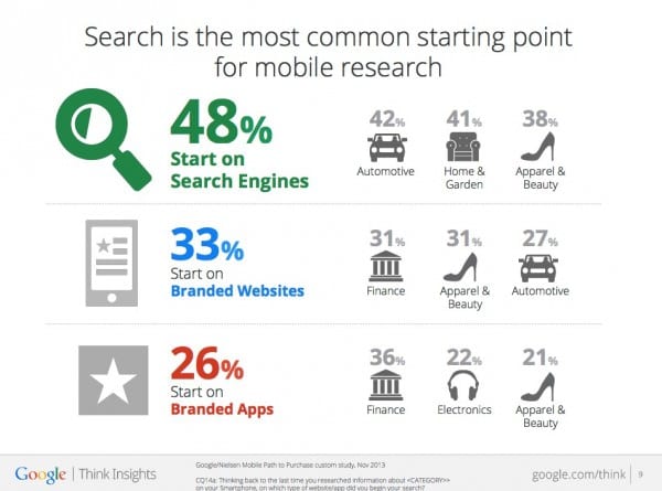
Some Interesting Mobile Usage Stats:
View our latest mobile website launch (on a mobile device)
If you have questions about, or need help launching a mobile website before April 21st, get in touch via the comments below, or contact us


