Going to the mall as a young teen with my Dad was absolute torture.
I’d ask him to give me a ride and drop me off at the doors, but he’d always insist on entering the building with me.
I’d spend hours getting ready so I could look exactly like my posse of girlfriends, and my Dad would wear track pants WITH his dress shoes.
In PUBLIC.
I was basically a permanent cringe.
When I’d beg him to wear something else – ANYTHING else – he’d shrug his shoulders, refuse and and say, “well, it works for me”.
“It works for me”
Last week I posted an article warning against letting your website become the online equivalent of an 80’s perm.
But being outdated and unfashionable online is totally fine – on ONE condition – that your website is working for you.
By working for you, I mean that it’s positively contributing to you achieving a specific goal.
Most of my clients tell me they want their websites to help them generate revenue.
If that’s your goal, than there are only a few basics you’ll need from your website.
In the case of your website, think like my dad (trends be darned!) to ensure your website works for you.
My big thumbs can’t click these tiny buttons!
It was 2015, in Nanton Alberta that I predicted you would see a decrease in where your website ranks on Google if you don’t have a mobile friendly website.
This may surprise you, but for the last few years, more people use their smartphones than desktops to navigate the web.
In 2017 the majority of web traffic is mobile.
So, if your website is next to impossible for the majority of people online to use, than it’s not exactly functional, is it?
What do I do next?
What action do you want your website visitors to take next?
Whether you want them to call you, give you their email address or shop online, it should be painfully obvious what the next step is.
All the visual indicators and functionality on each page of your website should lead to this action.
An example:
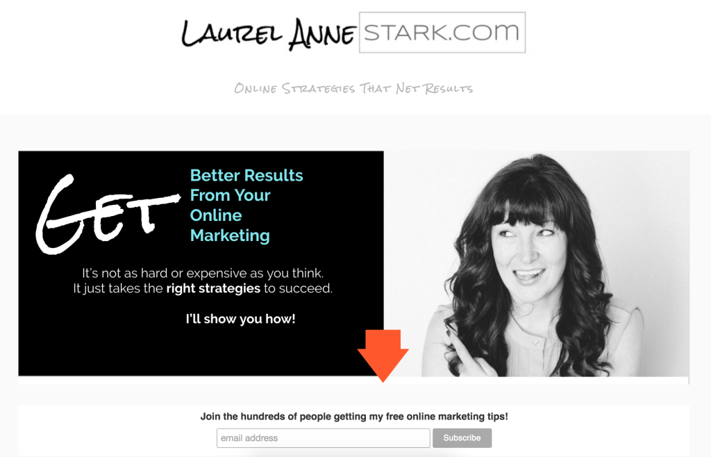
This is my home page.

With the funky orange arrow, you can tell exactly what I want you to do.
(Don’t be shy, you can feel free to head on over there and sign up for free online marketing tips)
Another example. Again using orange, you can tell we want you to Try TILOS.

I could go on, but I think you get the point.
Yeah? Prove it!
Sure, your website tells me you’re the best around, but I need you to prove it before I spend.
And I am not alone.
Most customers trust online reviews, or what other people say about you.
Take the time to ask for and collect customer reviews and post them on your website.
Literally, no-one can speak as powerfully to your potential customers as your existing ones.
This is called social proof, a phenomenon I discuss on CNN here.
In Summary:
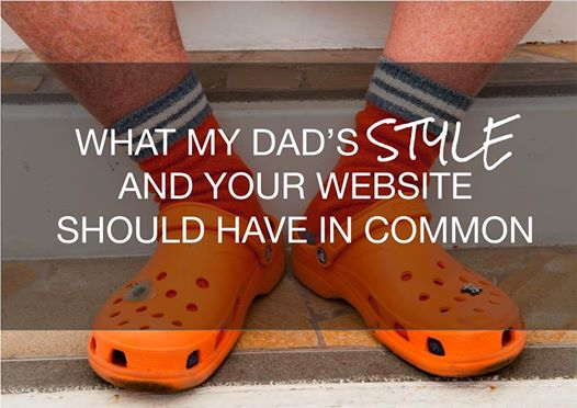
Whether your website is the crocs with socks style or more haute couture, it should be mobile friendly, have a call to action and social proof.
In my opinion, these are the three most important factors in making sure your website works for you and aides in your sales process and revenue generation objectives.
Sharing is caring!
If you found this valuable (or humourous), don’t be shy, share this with your network.
I’d love to hear your thoughts in the comments below…
Is your Dad more stylish than my Dad?
Did I miss a contender for the top three most important basics for a website in 2017?


